Practical performance advice for website owners
Accessible WordPress Performance: Fast Pages That Remain Easy to Use
Need hands-on help? Request a Speed Review →
WordPress performance advice · Reviewed 3 November 2026
In this guide
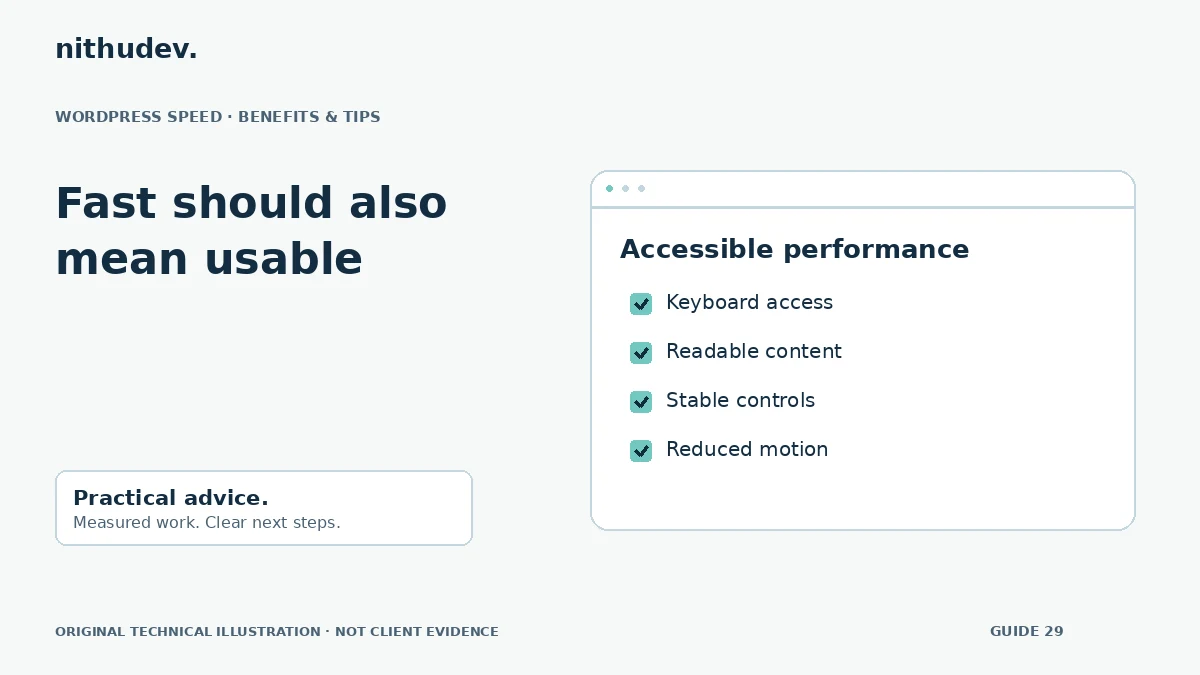
A lightweight website can still be difficult to use. A menu may respond quickly but trap keyboard focus; an animation may finish smoothly but make someone uncomfortable. Treat performance and accessibility as connected parts of the customer experience.
Keep important content available
Headings, service details and primary links should not remain invisible until a decorative script runs. Progressive enhancement allows a page to provide useful content first and add optional effects when supported.
If an optimization tool delays scripts or removes CSS, test the states revealed by interaction. Form errors, expanded menus and dialogs may need styles that are not visible in the initial screenshot.
Preserve keyboard and focus behaviour
Use the Tab key to move through navigation, pricing controls, forms and article contents. Check that focus is visible and that controls can be activated without a pointer. A faster custom control is not a good replacement if it loses its name, role or keyboard operation.
On narrow screens, comparison tables may need horizontal scrolling. Keep that scrolling within a labelled, keyboard-accessible region rather than allowing the whole page to spill sideways.
Use motion deliberately
Small transitions can help communicate state, but they should not hide content or require large movement. Respect a visitor’s reduced-motion preference. Avoid animated counters or decorative meters that imply measured results you do not have.
Auto-advancing carousels and background media need appropriate controls. Removing an unnecessary animation can reduce work and improve comfort. Where motion conveys essential information, provide an accessible way to understand that information.
Keep text and controls stable
- Reserve space for images and embedded content.
- Use readable fallback fonts while brand fonts load.
- Check that enlarged text does not hide the next action.
- Prevent sticky contact bars from covering fields or feedback.
- Retain sufficient contrast and visible labels.
Do not shrink text or remove useful spacing simply to fit more content above the fold. The first useful screen should be understandable, not merely dense.
Provide honest status feedback
Forms and purchases need distinguishable pending, error and success states. Make feedback available to assistive technology and explain what to do next. A button changing colour is not enough evidence that an enquiry was accepted.
Do not bypass anti-spam or payment verification to make an interaction appear quicker. Instead, reduce unnecessary work around the legitimate validation and keep the visitor informed while it completes.
Test with more than one tool
Automated accessibility checks can identify many issues, but they do not establish that every journey is usable. Combine them with keyboard review, zoom, reduced-motion testing and representative devices or assistive technology where available.
Report the checks actually performed. A zero-violation automated scan is useful evidence, not a full accessibility certification or a guarantee about every future update. Include functional and accessibility acceptance criteria in a performance project from the start.
Work directly with Nithu
Get help with your WordPress performance
I can review performance alongside keyboard access, readable layouts and form feedback, so a faster page remains useful to more visitors.
Request a Speed ReviewCompare the $79, $179 and $349 one-time packages →
No payment is needed for an enquiry. Scope is confirmed before work; paid tools, hosting and out-of-scope development are separate unless agreed. No fixed score or ranking guarantee.
Technical references
Written for website owners planning performance work. Technical options depend on the installed versions, hosting and integrations. Test changes safely and retain a recovery path. The featured diagram is an original editorial illustration, not a measured result or customer case study.