Practical performance advice for website owners
WordPress Mobile Background Images: Stop Downloading the Wrong Hero
Need hands-on help? Request a Speed Review →
WordPress performance advice · Reviewed 3 November 2026
In this guide
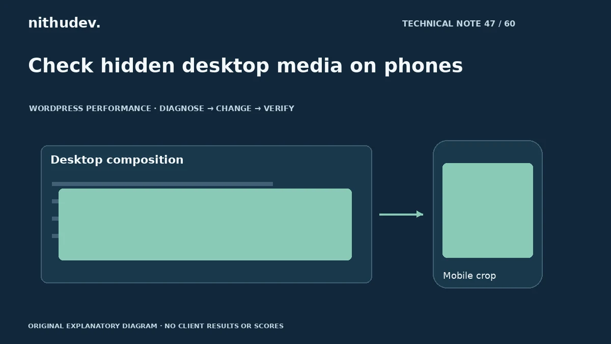
Your mobile layout hides the large desktop banner, but the phone still feels slow. Hiding a section visually does not establish which resources the browser requests. A background-image review starts with the network, not the builder’s visibility toggle.
Test the final public layout
Open the mobile page in a clean session and inspect image requests. Record the CSS or component that starts each background. Compare the file downloaded with what the visitor actually sees.
Check whether separate desktop and mobile sections duplicate text, widgets or media. A builder preview is useful, but the published page and its optimization transformations are the evidence that matters.
Consider whether a background is appropriate
Decorative backgrounds and meaningful content images have different roles. If the picture communicates information, an image element can offer clearer alternative text and responsive-resource behaviour. A decorative treatment may reasonably remain in CSS.
Do not mechanically convert every background. Preserve the intended layering, crop and brand presentation. The change should make the page easier to deliver and maintain.
Choose the correct source for the layout
- Use suitable dimensions rather than a full camera-sized file.
- Check the mobile crop and focal point.
- Avoid loading two competing hero variants unnecessarily.
- Reserve a stable section size without forcing unreadable text.
If art direction requires different images, use a supported responsive approach. Verify the actual selected resource at representative widths and pixel densities. CSS display size alone does not control the transferred bytes.
Investigate discovery and rendering
A CSS background may be discovered after its stylesheet arrives. A script-initialized slider can add further delay. Identify the real largest content element before adding preloads or other priority hints.
Keep essential text available independently of an entrance effect. A heading that remains invisible until a script starts can delay the useful first screen even when the image is already downloaded.
Test contrast and failure states
Check text over every crop and at larger text sizes. An image change must not reduce readable contrast or cover the CTA. Ensure the page still explains the offer if the picture fails to load.
After changing a builder template, regenerate relevant assets through its supported process and verify public caches. Do not leave old HTML referencing deleted generated CSS.
Record the result in context
Compare mobile requests and repeatable loading tests, then review the desktop design and functional journey. Keep a note of the assets and templates changed. A smaller background does not by itself prove more enquiries or improved rankings.
For a site with extensive duplicated templates, a broader layout review may be more useful than adjusting each image independently.
Work directly with Nithu
Get help with your WordPress performance
If mobile visitors download oversized or duplicated hero media, I can inspect the public output and implement a suitable responsive treatment.
Request a Speed ReviewCompare the $79, $179 and $349 one-time packages →
No payment is needed for an enquiry. Scope is confirmed before work; paid tools, hosting and out-of-scope development are separate unless agreed. No fixed score or ranking guarantee.
Technical references
Written for website owners planning performance work. Technical options depend on the installed versions, hosting and integrations. Test changes safely and retain a recovery path. The featured diagram is an original editorial illustration, not a measured result or customer case study.