Practical performance advice for website owners
WordPress Fonts and Speed: Keep Your Brand Without Loading Every Weight
Need hands-on help? Request a Speed Review →
WordPress performance advice · Reviewed 3 November 2026
In this guide
A website can load the same font through a theme, a page builder and a custom stylesheet. It may also request weights never used in the visible design. Font work is an opportunity to simplify delivery while keeping the brand recognisable—not a requirement to replace every typeface with a generic alternative.
Find every font source
Inspect font requests in the browser Network panel and trace the styles that initiate them. Check global theme settings, builder settings, widgets and embedded services. Identify the family, weight, style and character coverage actually used on key templates.
Do not assume a font listed once in a settings screen is downloaded once. Different URLs, subsets or integration paths can result in additional requests. Conversely, a variable font may serve a range of weights from one file; compare its real delivery cost with the site’s needs.
Reduce the design’s requirements deliberately
A restrained system might use one body family and one heading family, with only the weights needed for hierarchy. That is a design decision, not a universal numerical rule. Review the homepage, articles, buttons, forms and commerce templates so that an apparently unused weight is not removed from an important state.
For multilingual sites, preserve required characters. An aggressive subset that removes a customer’s language is not a successful optimization. Keep licensing requirements in mind before changing where fonts are hosted.
Keep text available while fonts load
Review the font-display strategy and fallback stack. Readability matters before the brand face arrives. At the same time, a dramatically different fallback can change line breaks when the final font loads, especially in large headings and compact buttons.
Test the actual hero text at narrow widths. Check whether the CTA moves or the navigation becomes taller after loading. A visually similar fallback and appropriate metrics can reduce disruption, but verify support and the effect in your real templates.
Do not preload everything
A preload should serve a resource the current page genuinely needs early. Loading every weight competes with images, styles and other important requests. Inspect the final request timing and confirm that the hint points to the file the browser actually uses.
Similarly, self-hosting is a deployment choice rather than an automatic speed guarantee. Consider connection reuse, caching, format delivery, updates and the legal right to host the file. Compare the resulting page rather than assuming one hosting location always wins.
Watch icon fonts and external widgets
A large icon font may be loaded for only one decorative symbol. Where practical, use the site’s existing lightweight icon system or a small accessible SVG. Preserve meaningful labels: a phone icon alone should not become an unclear contact button.
Third-party reviews, chat and booking interfaces may bring their own typography. Their loading and styling may not be controlled by your theme’s font switch. Document what the integration allows before promising to remove its requests.
Verify the design as well as the waterfall
- Text is readable before and after font loading.
- Headings and buttons do not unexpectedly wrap or jump.
- Bold, italic and multilingual text remain correct.
- Keyboard focus and form labels stay legible.
- The selected families still match the approved brand.
Save a comparison of requests and layout behaviour. The goal is a simpler, dependable type system. A smaller font transfer does not justify a broken language, missing icon or unreadable first screen.
Work directly with Nithu
Get help with your WordPress performance
I can review duplicate font sources and loading behaviour while retaining the typography that matters to your brand.
Request a Speed ReviewCompare the $79, $179 and $349 one-time packages →
No payment is needed for an enquiry. Scope is confirmed before work; paid tools, hosting and out-of-scope development are separate unless agreed. No fixed score or ranking guarantee.
Technical references
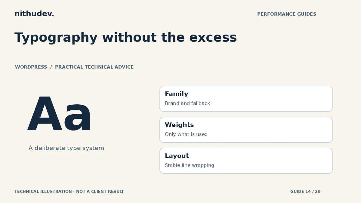
Written for website owners planning performance work. Technical options depend on the installed versions, hosting and integrations. Test changes safely and retain a recovery path. The featured diagram is an original editorial illustration, not a measured result or customer case study.